Glyde Marketplace - Multi-vendor Headless Marketplace powered by design tokens
Multi-vendor Headless Marketplace built on React, powered by design tokens to be endlessly customisable for each clients
Year
2022-2026
Client
Many
Platform(s)
Reach Web App
Areas
B2C, B2B, C2C, Service Marketplace
Project Overview
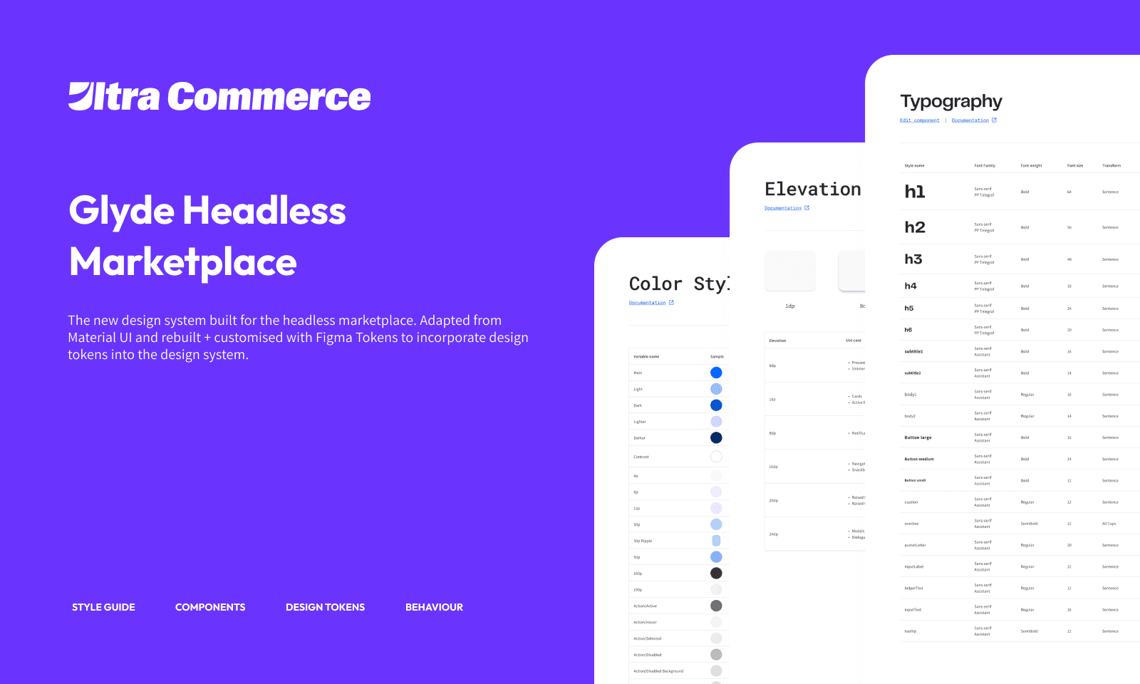
Glyde is the internal design system powering a headless, multi-vendor eCommerce marketplace. It supports a wide range of use cases, including B2C retail, B2B commerce, and service-based marketplaces, while remaining scalable and efficient to maintain.
As Lead UX Designer, I led the evolution of Glyde from a lightly customised Material UI foundation into a flexible, token-driven design system that tightly connects design and front-end implementation.
This case study focuses on three areas:
The construction and evolution of the design system
How token strategy adapted to real client needs
How the system was applied through two core modules: Checkout and Service Enablement
Designing the Glyde Design System
System foundation and technical alignment
Glyde is built on Google’s Material UI design system. This foundation was chosen to align closely with our React-based front end, which relies on MUI components.
Starting from Material UI allowed us to reduce friction between design and development, minimise rework during implementation, and ship faster with consistency across products.
Using MUI as a base did not mean adopting it without change. I led the effort to restructure and customise the system so it could support multiple brands, markets, and business models while remaining technically viable within a headless architecture.
Token-driven customisation and theming
To support scalability and flexibility, Glyde relies heavily on design tokens. Using Token Studio, we established a workflow where:
Tokens are defined and managed in Figma
Tokens are exported as JSON
Translated through a style translator
Rendered into TypeScript files that generate CSS on the front end
This approach allowed styling changes to move directly from design into production with minimal manual intervention.
As a result, design-to-front-end styling time was significantly reduced, client customisation became faster and more predictable, and the platform could support multiple brand identities without duplicating effort.
I owned the structure and governance of this token system and worked closely with front-end engineers to ensure it remained practical and maintainable.
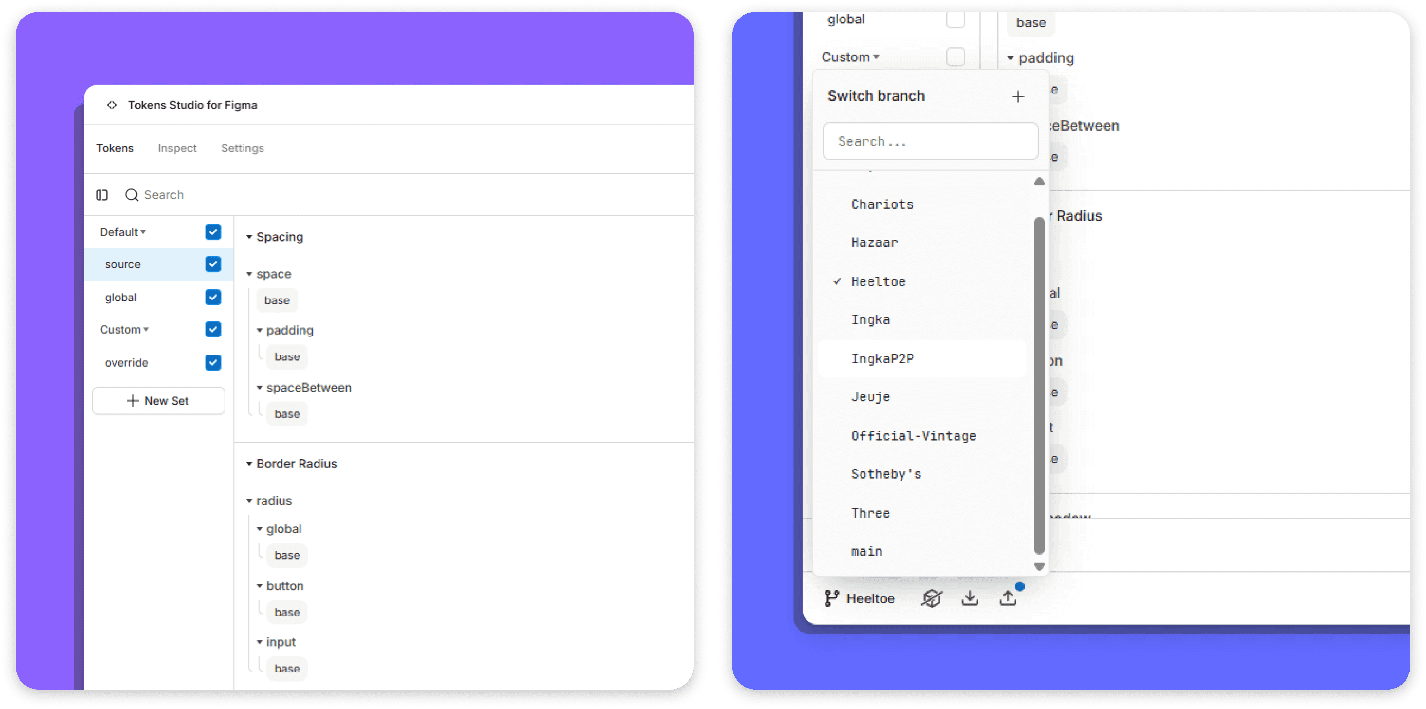
Token structure consists of a source file where the base values of each token are stored. The 'global.json' file then references these base values, creating the tokens that are used globally within base theme. For each client, we then customises the values of the source file within 'override.json' to generate a completely new token files that can be exported from Figma and be used on the front-end.
Token strategy challenges and evolution
Initial assumptions
In the early stages, we aligned closely with Material UI’s default token structure. The assumption was that most clients would be satisfied with a strong out-of-the-box experience with minimal customisation.
As more clients were onboarded, especially those migrating from our legacy marketplace platform, this assumption no longer held true.
Clients requested a wide range of changes, including:
Small visual adjustments such as button colours
Interaction changes such as hover behaviour
Larger structural changes affecting component shape and style
The existing token structure was not expressive enough to support these requirements without breaking the design-to-code workflow.
Expanding the system without breaking it
Rather than rebuilding the system or abandoning tokens, we evolved the token architecture incrementally.
I led the expansion by introducing new tokens only when repeated client needs emerged, while preserving modularity and keeping the Figma-to-code pipeline intact.
This required careful trade-offs between flexibility and complexity. The goal was to support more client variation without increasing development overhead or losing the original purpose of the system.

The result was a design system that could evolve with client needs while remaining coherent, scalable, and efficient.
Module 1: Checkout
Context and problem
The checkout experience in our previous marketplace platform was outdated and slow, contributing to cart abandonment. I was tasked with designing a new checkout module for Glyde that focused on usability, speed, and conversion.
The checkout needed to be modular, reusable across clients, and flexible enough to support different business models.
Research and journey mapping
I began with a competitor analysis across major eCommerce platforms to understand current checkout patterns and user expectations. This research informed layout decisions, interaction patterns, and content hierarchy.
Based on this, I mapped the end-to-end user journey.
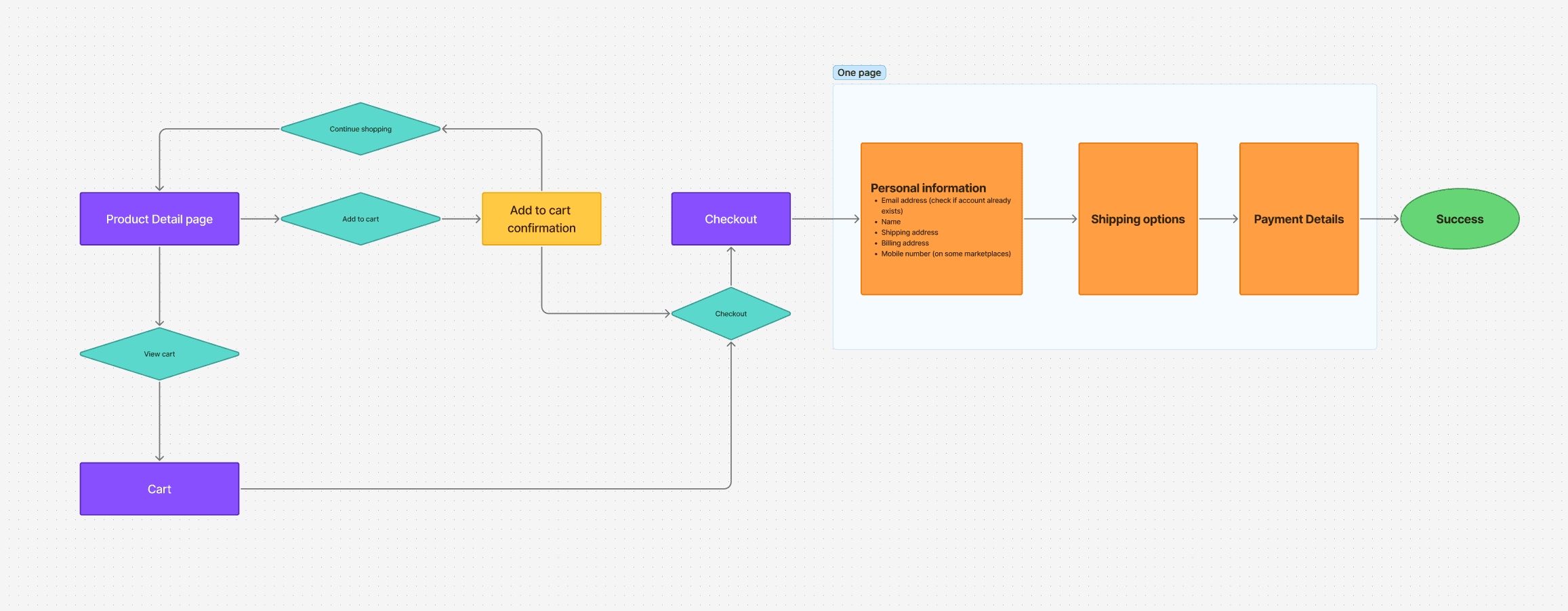
Mini-cart versus cart page
A key decision was whether to retain a traditional cart page or adopt a mini-cart.
Through low-fidelity testing, users consistently reported that a mini-cart felt less committal and allowed them to review items without interrupting their shopping flow. Based on this feedback, we adopted the mini-cart pattern.

Simplifying checkout structure
The original checkout flow was split across multiple pages, requiring users to submit information in stages and wait through page loads.
I consolidated the flow into a single-page checkout, structured into clear steps. This reduced loading time, maintained clarity, and lowered cognitive load.
To keep users focused, the standard navigation and footer were removed during checkout.
Guest checkout and login changes
As part of the redesign, I introduced a new login and guest checkout entry point intended to simplify access for new users. While the intent was sound, this change later surfaced an issue after launch.
Outcome and iteration
After launch, the checkout initially received negative feedback. The first live client using the new checkout, Buy Kiwi, experienced an 50% drop in conversion rate.
Using Userway data, we identified the main drop-off point. Users were confused by the login and guest checkout call to action and were unable to proceed after selecting that they were new customers.
The issue was a small interaction detail. The call to action relied on an arrow icon instead of a clear label.
We replaced the icon with a clearly labelled “Continue” button. Following this change, Buy Kiwi’s conversion rate improved by 70%, reducing checkout drop-off by ~15–30% depending on entry funnel.
Reflection
This issue highlighted a gap in our testing process. We focused heavily on shipping new functionality and did not test the guest checkout entry point thoroughly enough.
The experience reinforced the importance of validating even small interactions, especially in high-impact flows such as checkout.
Module 2: Service Enablement
Context and opportunity
Service enablement was not supported in our previous marketplace platform. It represented an opportunity to expand into new markets and support service-based businesses.
This module was designed from the ground up.
Research and competitive analysis
To understand established patterns, we analysed service-based marketplaces such as Booksy, Fresha, and Vagaro. Insights from this research informed both the interaction patterns and booking mental models.
Based on this, I mapped the customer journey.

Service discovery and location awareness
The initial service listing experience focused on filtering by service, date, and location. Early testing revealed that users also wanted to understand distance and access directions.
To address this, we added a map view to the service listing page and introduced a “Get directions” action on service provider pages.

Booking flow prioritisation
Booking a service requires selecting a service, date, service provider, and time. A key challenge was determining the order of these steps.
User interviews revealed two distinct behaviours. Repeat customers prioritised specific service providers, while new customers prioritised available dates and selected providers based on ratings.
After discussion with the team, we designed the primary flow as service, date, service provider, then time. This prioritised new customer conversion, which was the platform’s main growth goal.

To support repeat customers, we introduced a Favourites feature that allows users to book directly with preferred providers without repeating the full search flow.
Outcome
The service enablement module is still in development and has not yet launched with live clients. Early user testing has been positive, with participants reporting that the booking process is easy to understand and the step-based structure feels clear and efficient.
Reflection
Designing Glyde required systems-level thinking across design, engineering, and business constraints. As Lead UX Designer, I owned the design direction, collaborated closely with cross-functional partners, and made deliberate trade-offs to deliver a scalable platform.
This project reflects my approach to senior design work: designing for scale, grounding decisions in real constraints, and treating design systems as evolving products rather than static assets.