Three Ireland Self-service B2B Marketplace
Led the design effort for the design and user experience of a first-of-its-kind self-service, telecom B2B marketplace for the largest telco provider of Ireland.
Year
2025-2026
Client
Three Ireland
Platform(s)
React Web App
Areas
B2B
Project overview
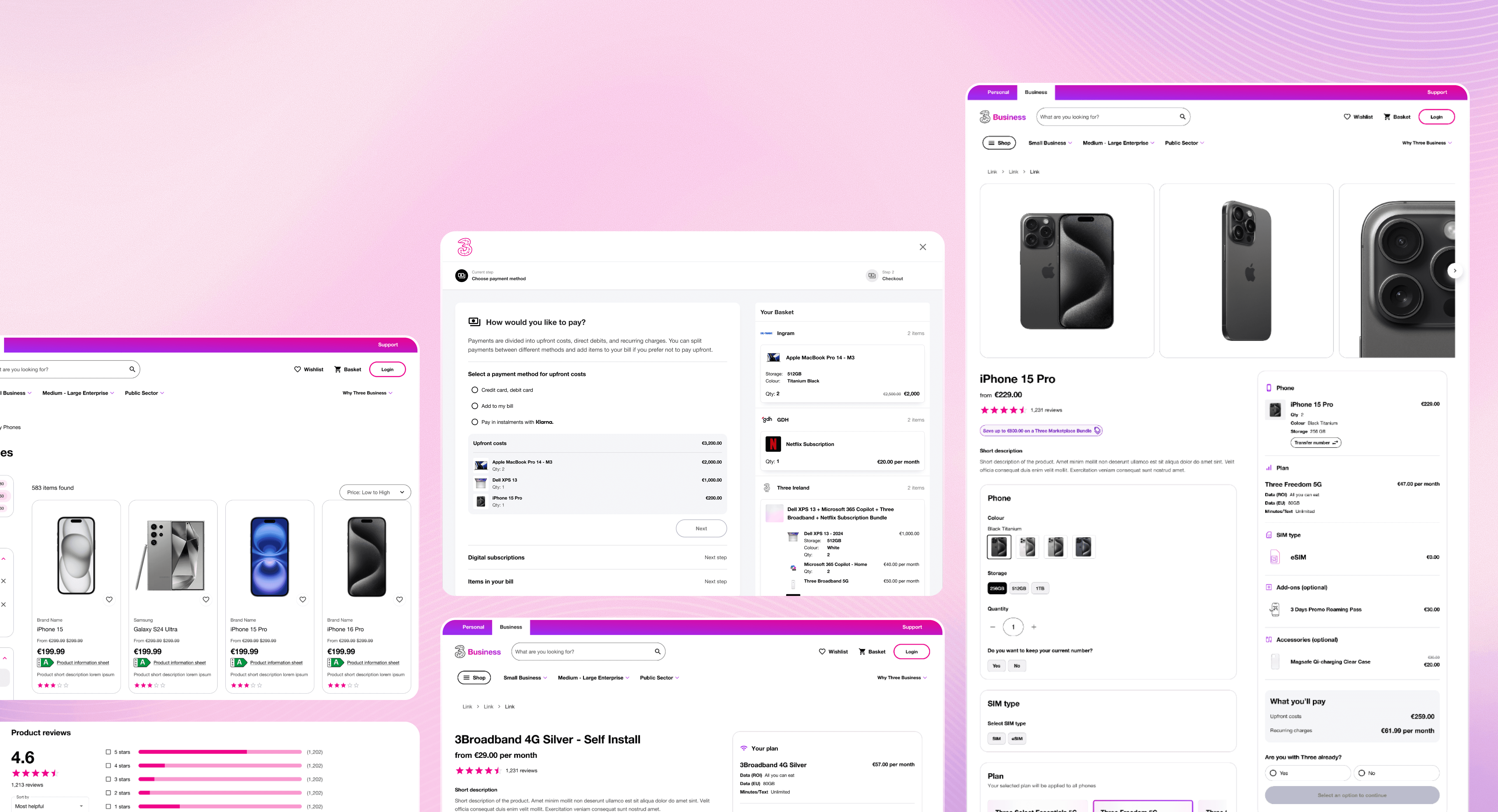
The Three Ireland B2B Marketplace represents a significant shift in how telco products are discovered, configured, and purchased in Ireland. This project marked the first time a major Irish telco introduced a self-service ecommerce marketplace for business customers, targeting sole traders and small to medium enterprises.
As design lead, I worked across product strategy, experience architecture, and detailed interaction design to help define a scalable marketplace foundation that could evolve into Three’s long-term ecommerce hub.
Key role & responsibilities
Led the end-to-end UX design of the Three Ireland B2B Marketplace from concept through delivery
Designed the marketplace experience from the ground up, defining core journeys and interaction patterns
Collaborated directly with Three Ireland stakeholders and their internal design team to align on vision and execution
Iterated designs based on client feedback, user testing insights, and evolving business requirements
Worked closely with business analysts and developers to balance technical constraints, business needs, and user experience
Owned and managed the marketplace design system to ensure consistency and scalability
Delivered a user-centred marketplace experience within real-world delivery and platform constraints
Key product challenges & design decisions
Redesigning the Product Detail Page for Performance and Scalability
Key design challenges:
The existing Product Detail Page experience was built as a multi-page flow, requiring customers to progress through several steps with frequent loading states between each configuration change. While functional, this approach introduced friction into the shopping journey, disrupted user momentum, and limited the platform’s ability to support more advanced product bundling in the future.
Design Decisions and Rationale:
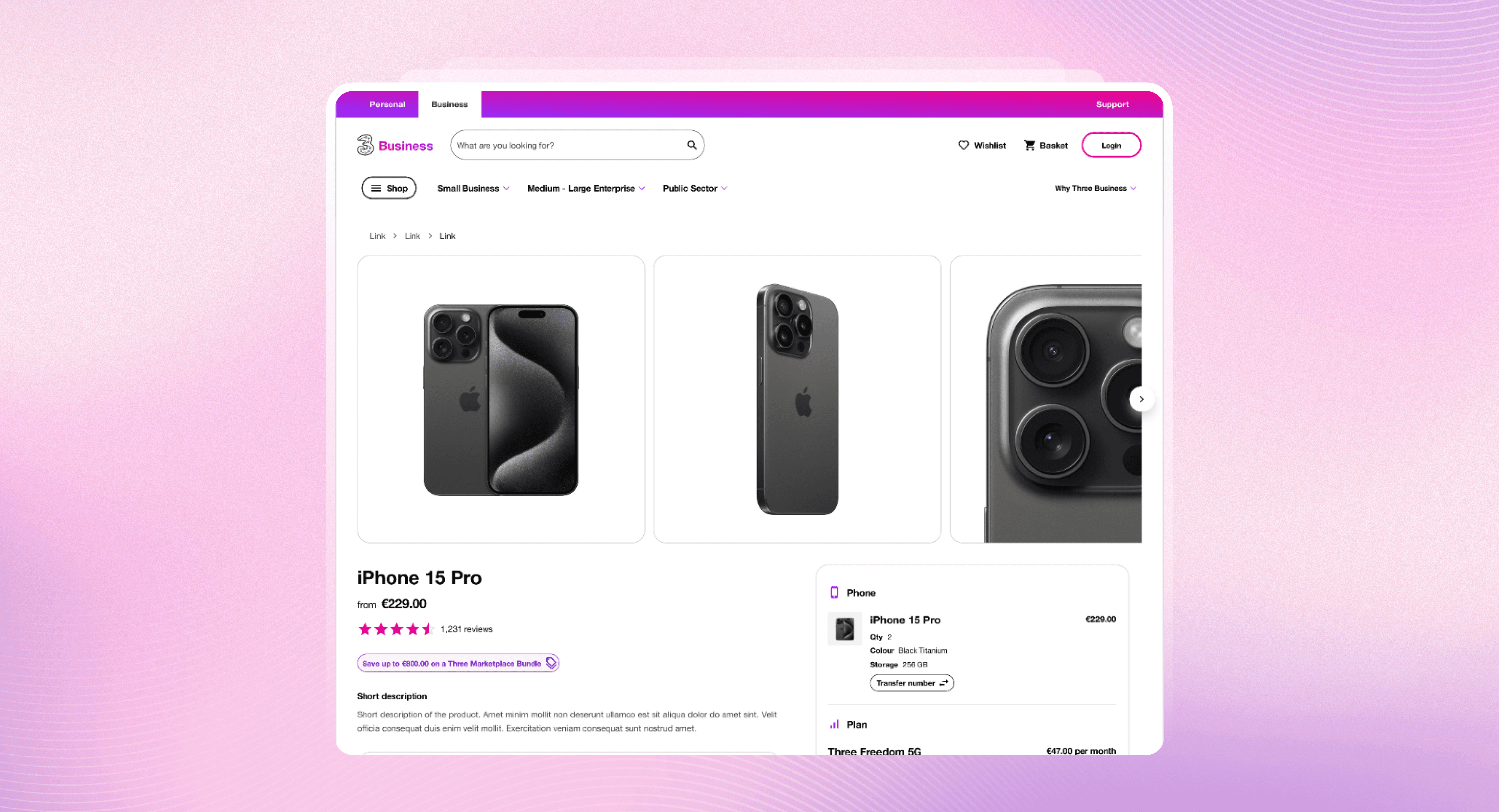
As part of the marketplace redesign, the Product Detail Page was reimagined as a single, unified experience. The goal was to significantly improve usability and perceived performance while creating a foundation capable of supporting increasingly complex bundle configurations.
The redesigned experience focused on:
Consolidating configuration into a one-page flow to eliminate disruptive loading screens
Enabling more robust and flexible bundling without increasing cognitive load
Providing clear, persistent feedback so users could easily track the choices made within complex bundles
Elevating visual hierarchy and interaction design to better reflect a modern, premium telco experience
By reducing friction and improving clarity, the new Product Detail Page allowed customers to configure and purchase complex telco bundles more quickly and with greater confidence, directly supporting improved conversion rates and long-term product scalability.

Analysis of Three.ie current customer purchase flow. Note the red triangles are the times where there are loading screens within the purchase flow, creating friction. This is also a B2C flow, designed to only cover 1 device & number transfer request per purchase in contrast to B2B where most purchases will be done in bulk.

After reviewing the current flow and identify possible pain points, initial stage of discovery was done through competitor analysis across several Telco marketplaces throughout the world.



Some early iterations of the Product Detail Page, focusing on the bulk buying aspect which is expected to be the more common use case for B2B from user research. Some designs take cues from the current way that Account Managers are shopping from Three with an agent - using tables to mimic excel sheets.
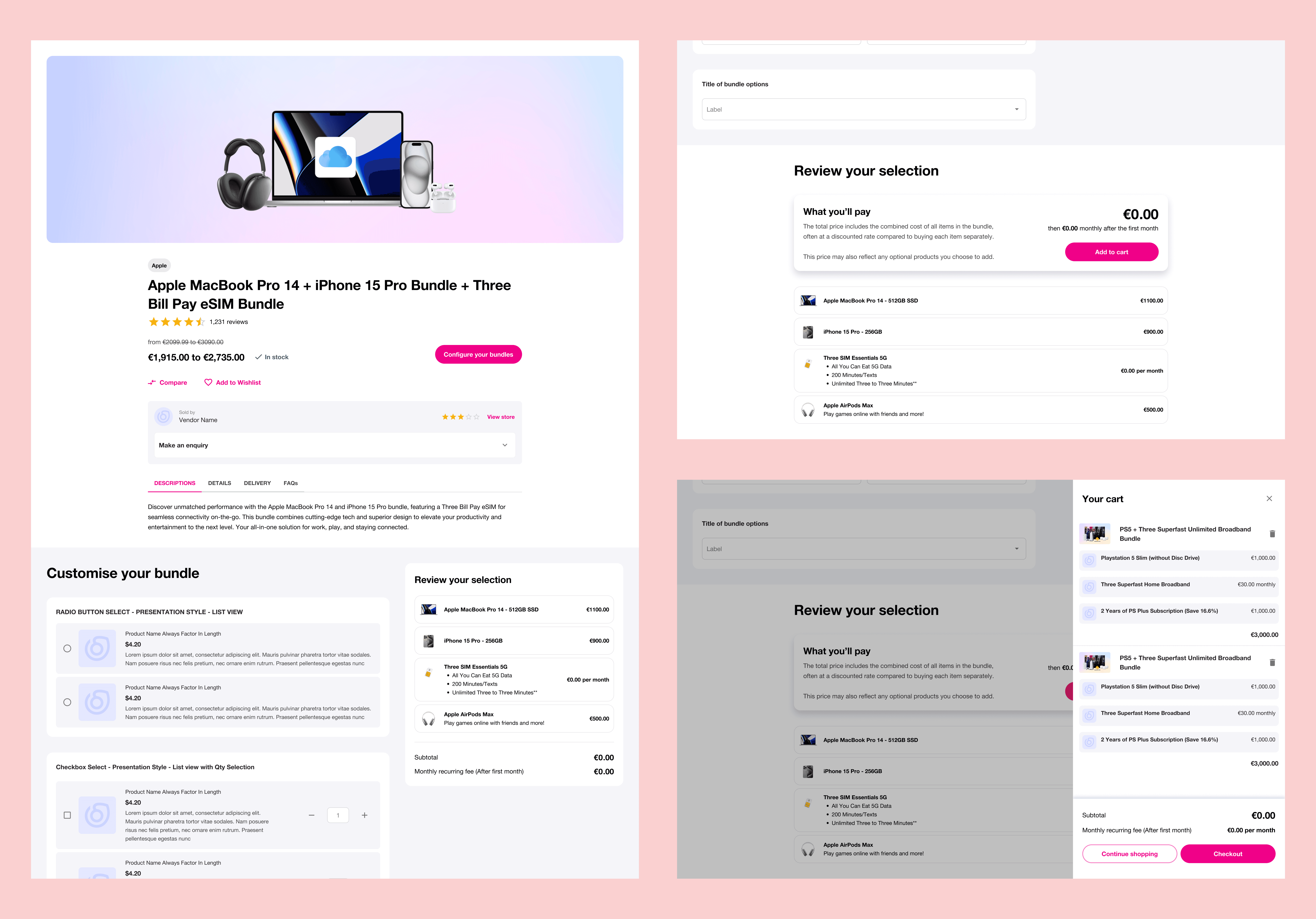
More early iterations on the Bundle PDP concept. This concept is after the scope is scaled down to focus more on sole traders and SME type customers.
Outcome:
Final iteration of the bundle PDP. This version takes the concept from the earlier iteration that focused on sole traders & SMEs and further improve the look and feel & provide more feedback for users while configuring their bundles. From our user testing, this PDP has managed to shorten the time for customers to configure their products by a significant amount of time, up to 50% less time spent than the current live version of the PDP. The look and feel improvements received positive remarks from test participants as well for looking cleaner and more modern than the current live version while still maintaining and 'look' like a Three Ireland website.
Designing a Split Payment Checkout for Diverse B2B Scenarios
One of the most distinctive aspects of the Three B2B Marketplace is its ability to support split payments. Customers could divide upfront and recurring costs across multiple payment methods, including Klarna, credit cards, subscriptions, and direct debit through telco billing.
Key design challenges:
This introduced a highly complex checkout journey. The experience needed to accommodate:
Different customer types, from sole traders to larger SMEs
Mixed baskets containing hardware, plans, and services
Regulatory and compliance requirements tied to telco billing
Conditional payment availability based on eligibility and credit checks
The design challenge was to surface this flexibility without turning checkout into a decision maze. The solution focused on guiding customers through clear, step-based choices, supported by contextual explanations and cost summaries that updated in real time.
Design Decisions and Rationale:
The checkout was intentionally designed as a system rather than a single flow, allowing new payment models and eligibility rules to be introduced without redesigning the entire experience.
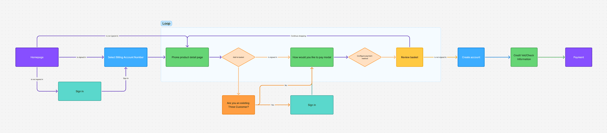
Early proposed purchase flow based on the planned technical implementations. In this version the customer is greeted with a modal where they will have to select how to pay every time they plan to add another item in the basket, potentially causing friction.

Early concept and prototype on the above flow would show the customers 2 modals after they click on add to basket. This was done as a proof-of-concept to show usability flaws for the clients and the internal team, demanding that we change the way the tech specs are to be built.
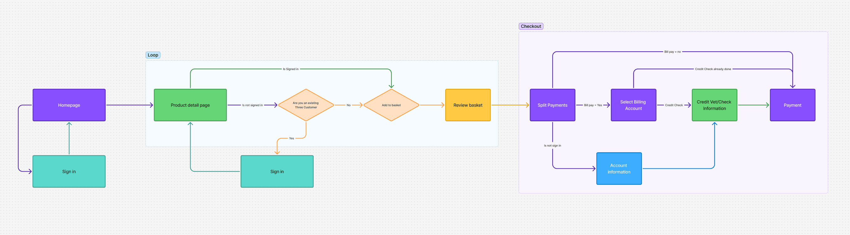
Revised user purchase journey. After reconsideration, we realised that the Billing Account number selection is not necessary for every flow since we allow no Bill Pay items checkout. We have also integrated the Split Payments into the checkout process, reducing the friction caused by the user having to configure their payment method every time after clicking add to basket. This also allows us to move cut the process further into clearer steps, reducing visual clutter and cognitive overload for users.
Outcome:
Finalised version of the checkout based on user purchase journey outlined above
Through user testing, the team iterated and settled on this finalised version as seen above. This version received positive user feedback, with many users appreciating the split payments feature, especially the detailed cost breakdown each item within the basket. This is a stark improvement on the previous iterations and a step forward for Three as a B2B marketplace to have an easy to understand, self service marketplace for B2B clients.